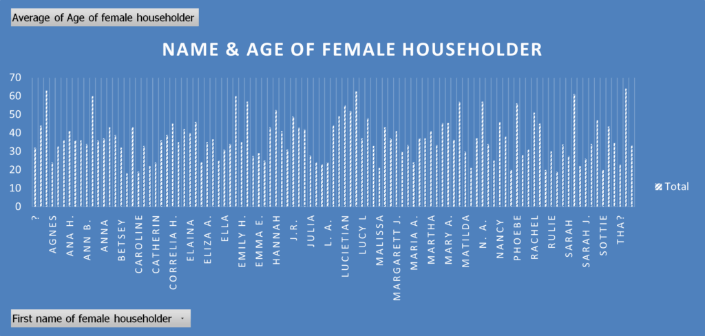
I played around with generating a variety of more or less successful bar graphs. Many seemed garbled by my extremely rusty quantitative thinking skills, and I found myself rather unsure of how to begin determining questions to ask/answer with the data. In the above chart, for example, I gather that a householder is the standing head of the household. I can’t quite wrap my head around why there are multiple bars per name, especially when I have averaged the age. Some of these also don’t seem like names (“Lucietian,” “Rulie,” etc.) I do think working with the data in Excel improved my understanding of it though, even just looking at possible categories of data (countries of interest when tracking heritage, verbiage on disability) was illuminating.